Diagetic UI, or a Cyberpunk interface?
How you highlight a player’s journey in a game with UI really guides their experiences. Games like Dead Space, with their Diagetic UI are great… but so are worlds with huge cyberpunk-style HUD displays that get you immersed through other means such as subtle screenshakes and distortion.
The Process
1. Spinning Up The first thing that I do is create a set of three design pillars. Luckily, for this project we already had a set of definied pillars:
- Story Driven Exploration
- Approachable Gameplayames.
- Immersive and Emotional Impact
- Ethereal Game Feel
2. Whiteboxing Ideas
The first thing I do when I’m creating a UI is I start to whitebox some ideas out, typically with a whiteboard or a virtual one.

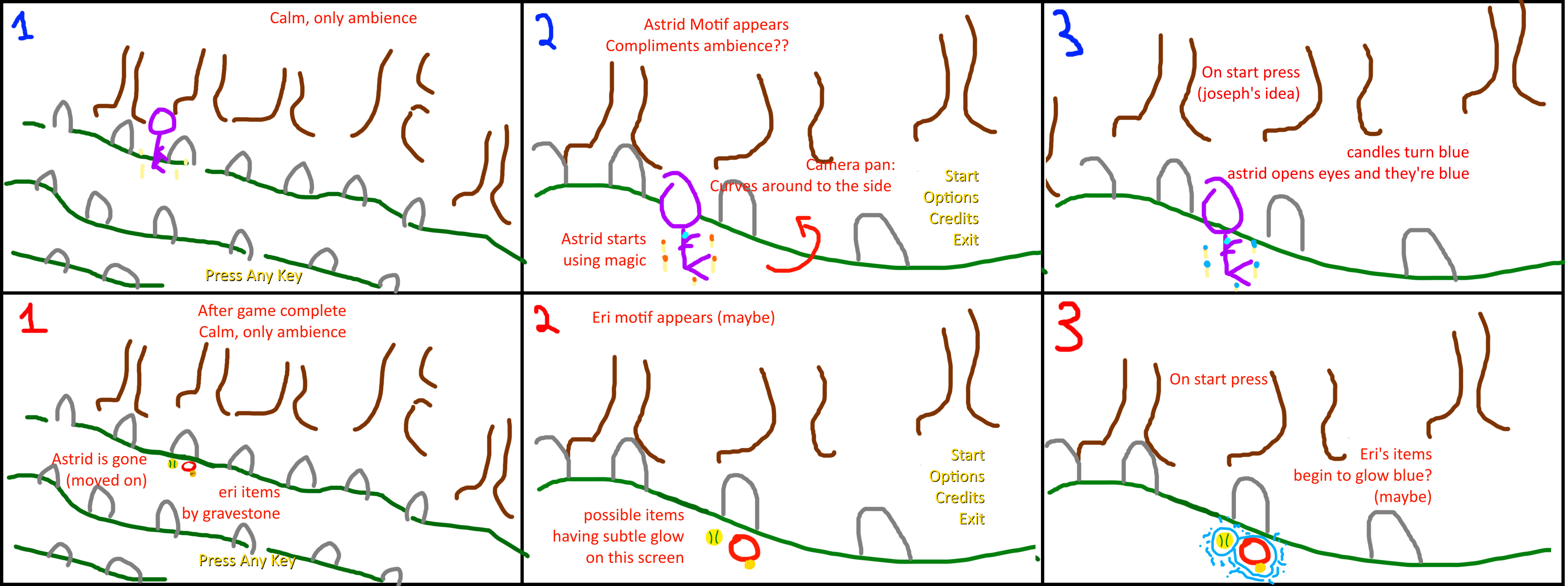
For this particular project, I’ll be talking about Shadow’s Grove. In this project, we wanted a diagetic UI with a main menu that would be able to change as you get closer to playing the game.
We went for two separate main menu sequences: the top half being before you play the game, and the bottom half after you complete the game.
As you got closer to playing the game, the action in the scene would ramp up slowly.
3. Figma Prototyping

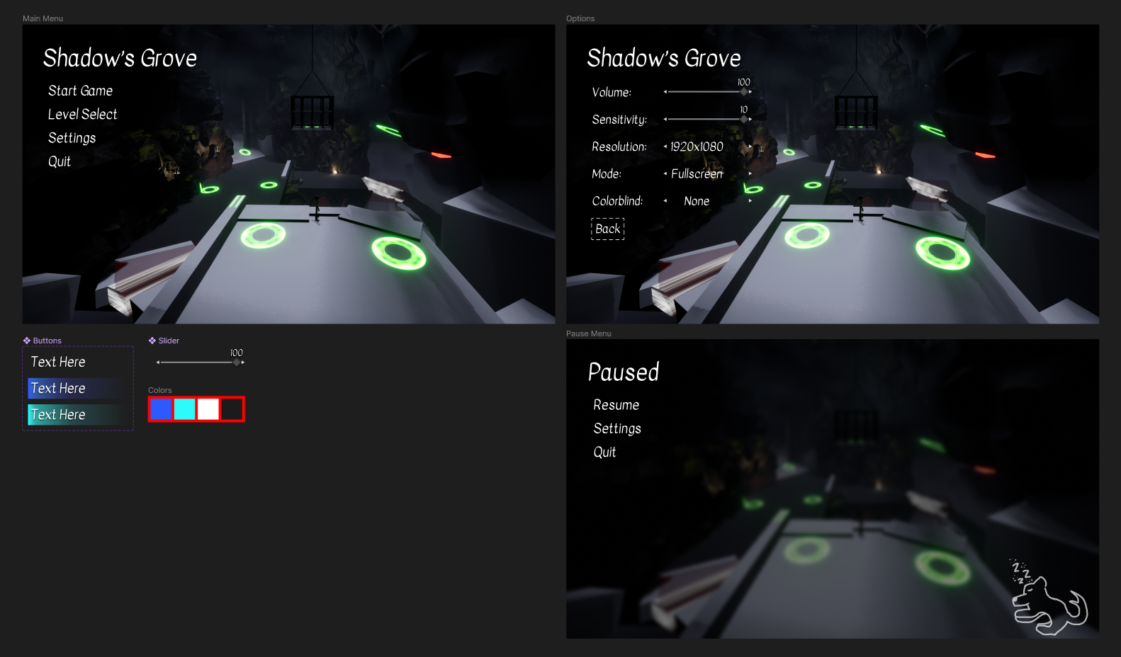
Then, we moved onto prototyping. A lot of this is based on ‘feel’, and as you can see from the design we decide to go for the top left menu to allow the eyes to focus more on the scene than the menu itself once you first open the game.
I utilized a color swatch and components so we could quickly see new prototypes around the scene.
4. Quick Tests/Rough Art Pass
Next, we move forward and I work with programmers on prototyping the UI inside of the scene for gameplay without an art pass. This is where I’d make sure that people are able to navigate the UI before allowing any artists to make a rough art pass to avoid wasted work.
Only aftering testing at this stage do we create assets and test the rough art pass to make sure the planned visuals effects/transitions (if any) aren’t going to cause any readability issues, motion sickness, etc.
5. Polish!
Finally, we achieve our polish stage, which entails final passes on:
- Art
- Animation
- Sound coming to a polished product!
6. Retrospective
Then, as with all projects I’ll take a look at the big picture:
- What feels good and what doesn’t?
- How can I change things in this project to function better?
- How might I use what I learned here on other projects?
For this particular project, a lot of the ideas we had were overscoped in the beginning. Having two separate diagetic scenes for the game would have been really cool but overall had low importance. Players would have felt an impact from that moment, but it wouldn’t have been enough of a draw for us to put resources into what would inevitably be a small moment (or possibly an unnoticed moment) for most places.